We have worked on a visual update of the e-conomic websites in order to create a clearer and more direct communication with our customers and an easier sign-up for the e-conomic accounting system. ‘Simple’, ‘casual’, ‘friendly’, ‘professional’ have been some of the keywords for the work along the way – in line with the overall e-conomic spirit and values. The website is for our customers, new and old, but also reflects who we are as a company.
Another reason for the redesign is simply a need and wish to keep up-to-date with modern design trends and act as a leader, not just in our accounting apps, but also in the way we portray ourselves and in the quality of our design and communication.
Removing a lot of visual clutter has helped to create a simpler style that is more ‘to the point’ and ultimately provides better guidance for visitors to our sites. You will no longer see pages with 5 buttons in different colors, but more likely a nicely structured page with one or two relevant calls to action.
Below you can see the main changes to the website – also scroll further down to read more about what we have changed and why.
A cleaner and more simplified design:
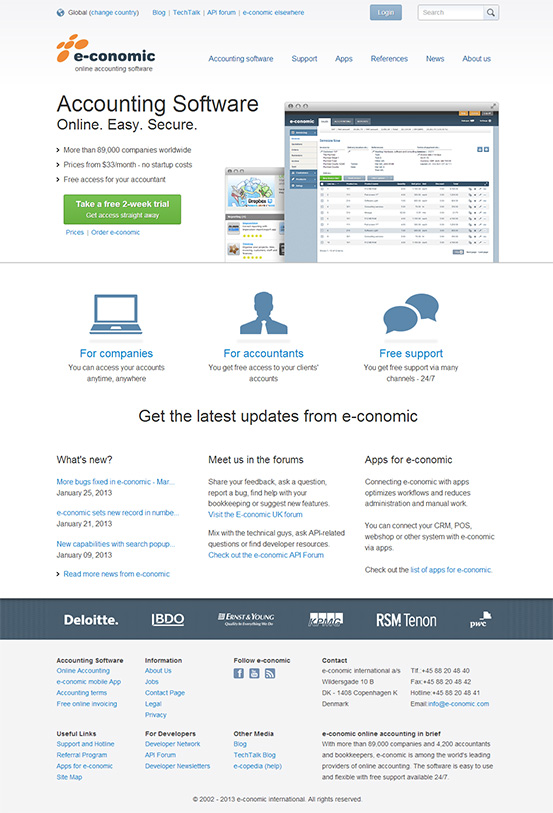
A home page with easier signup and more focus on the look of the e-conomic application:
NEW
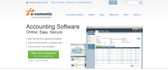
OLD
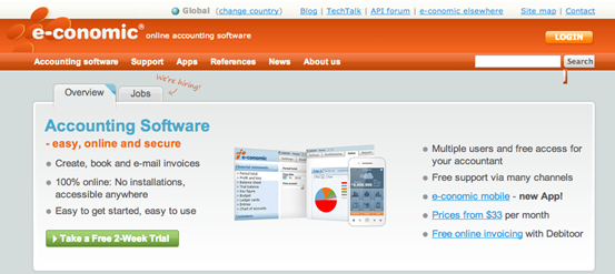
Redesign of the header…
NEW

OLD

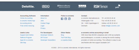
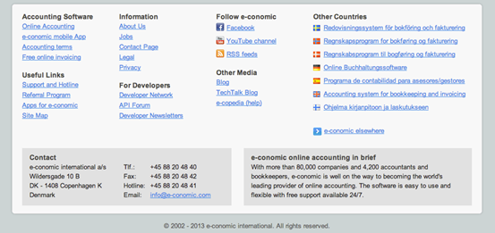
… and footer:
NEW
OLD
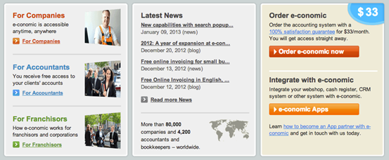
More icons and illustrations, less photos:
NEW
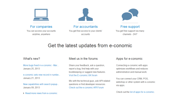
OLD
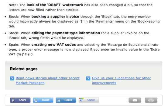
Bigger and more legible font size, plus new share icons at the bottom of articles:
NEW
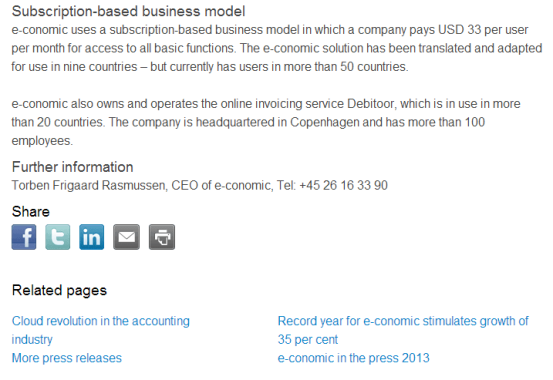
OLD
Some background
The home page is our public face and the place where most people meet us for the first time. As we all know “first impressions last”, so a major part of the work has gone into a much needed facelift of our home page. Our aim was to create a clearer and more concise look with less clutter and mixed messages.
Because of its importance, the home page has undergone some early testing with potential customers. The feedback pushed us towards putting much more emphasis on the actual product – our application – than we had initially planned. We learn as we go, and as the test results showed us there was a strong leaning towards a more direct communication about our product. In short, our users wanted to see what we are selling.
We put some efforts into prioritizing content, with large screenshots of the application, the most important messages highlighted with bigger fonts, and a reduction in colors and items – all done to draw focus to the application and a few relevant key messages. Potential customers can now get a quick idea of what we are all about and a realistic understanding of what they are signing up for.
Make it relevant and consistent
Another focus has been to create consistency across the design. The header and footer have undergone a thorough restyling and optimization (see screenshots above) to allow easy navigation and provide a better overview. All images have an outlined box with a shadow to make even very different visual expressions seem unified. In many places we have replaced photos with icons or illustrations to convey a clearer message and avoid routine stock photos –which were deemed “untrustworthy” in our user tests.
On subpages we have moved the share icons, so that they only appear at the bottom of an article. The full redesign of these pages also includes a structural change to better align text and optimize line lengths for better legibility. This part will, however, only be released at a later time.
More to come…
Not all changes have made it to this first version of the redesign. We will be aiming to include these changes soon, and strive for even more continuity in the design and structure of all our websites and media in the near future. Furthermore, now that the look and feel of the websites have been updated, we can start to go a step deeper and look at content and structure in order to go all the way with simplifying the user experience.
For now, have a look around our websites and see what you think. We hope you will enjoy it and recognize some of the ideas and priorities I have talked about in this post. And please leave a comment below to help us in our work going forward.